A brand idea with a purpose
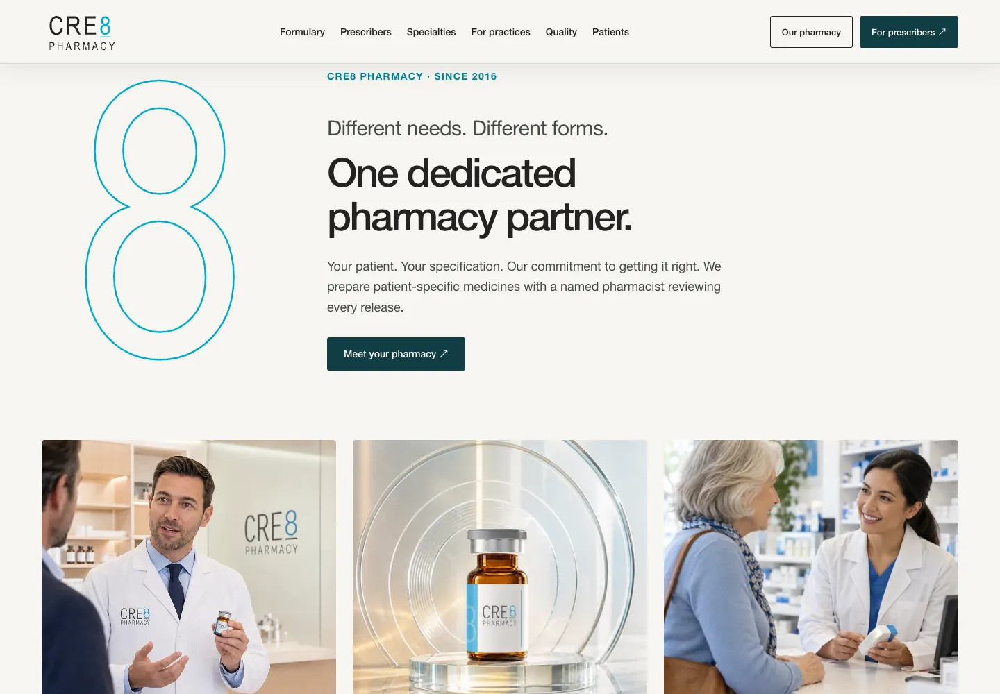
The eight from CRE8’s logo becomes a recurring motif across the site, connecting patient needs, the prescriber’s direction, and pharmacy expertise.
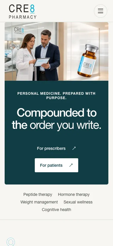
Separate paths for patients and prescribers, connected by a pharmacy identity built around the CRE8 eight.
Information architecture · Copywriting · Visual design · Image direction · Front-end development

Selected screens from the completed design, currently on staging.
The eight from CRE8’s logo becomes a recurring motif across the site, connecting patient needs, the prescriber’s direction, and pharmacy expertise.
Dedicated paths for patients and practices make it easier to find relevant information without reading the whole site.
Product imagery, photography, typography, and the glass eight carry the same identity from the opening screen through the formulary.
We handle the strategy, content, design, development, and promotion around your business goals.
Discuss your project ↗Back to selected work